
Being fashionable as a man has slowly but surely become a more common thing. Since fashion is always evolving it can be hard for guys to stay trendy, especially those who want to remain masculine, urban and edgy. I’ll outline some of the current trends in mens fashion as well as timeless practices that are sure to make you stand out while being original.
Don’t over complicate – One of the most common things men do is try and go overboard when looking stylish. The point is to look like you just threw your outfit on, even if you spent an hour or a few hundred bucks on it. Ironic isn’t it? Don’t over accessorize or wear more than one item that is too ‘loud’ such as strong patterns, bright colors or flashy items.


Dress up, Not Down – An easy rule to follow is dress up for an occasion rather than down. It doesn’t take much to wear a button up shirt or a nice pair of pants. Often putting on one or two pieces of business / dress wear and the rest of your outfit casual allows you to fit in just about any occasion.
For now I’ve provided a few urban fashion tips for guys and plan to continue providing more great tips. If you’re looking for any specific ideas or tips make sure to give a search above or submit a question to our submission form or check out some of the inspirational outfits I’ve found.
Men fashion High colletion guide
T-Shirts- I like to wear plain V-neck shirts in solid colors. To me, V-necks have a bit more flair than just the run-of-the-mill crew necks. Some of the basics are white, black, heather gray. Since it’s gonna be spring/summer, pick up some of the brighter colors as well like light blue, yellow, red, melon, etc.
- However, that doesn’t mean crew necks aren’t as good. Plain crew necks won’t look as good as a plain v neck, and you may look hobo-ish. The key to looking good in crew necks is a good fit. Keep the shirt trim and cut close to your body. It looks a lot better if you’re athletic.
- Henleys are another option. Make sure they are light, spring colors like aqua, white, yellow, etc. The only problem with these is that I have yet to find a store that sells them cheap with good colors that can last more than a season. American Eagle sells some henleys, but they seem pretty thin and don’t look like they’ll last more than a season.
-
.You want it to look fitted on you, and baggy t-shirts scream either 1) bigger and trying to hide it, 2) Can’t fit-shirts properly, or 3) hobo.Last Reminder: It’s just a t-shirt

Button Up Shirts
For button up shirts, look for plaids/gingham as they are more kid-friendly. I hate to say it, but Abercrombie probably has the best selection of plaids, except they’re about 70 bucks for a shirt. If you have some money to blow, hit up Abercrombie/Hollister for their plaid shirts. Gap has really nice shirts with decent quality.
- OCBDs look great with shorts/chinos, but idk if you’d wanna go that route in high school. It works on some people, but it makes others look like they’re trying too hard. Make sure you iron them, because I think it looks a little sloppy when they’re all wrinkly. Get light, spring colors. Sea/bright blue, light blue, light green, light/pale yellow, pink, etc. all look good. Make sure that they are kind of faded/muted colors, though, because bright blue or hot pink pretty much just screams “DOUCHE”!
If you’re slim/alright (read: not obese), you should be able to pull off short sleeve button up shirts. Make sure they are fitted, especially in the sleeve and body area. - Always unbutton the top button, unless you think you’re cool enough to wear it buttoned. I like to keep the first and the second buttons open. It gives off a more casual vibe. If you’re wearing an undershirt, make sure you can’t see the undershirt.
Please, please, please, don’t unbutton the shirt completely and wear a t-shirt under. Please.
- Keep them slim fitting, and make sure they end around the middle of your pant’s fly. When you wear them tucked in, it’ll look out of place at school. It’s okay if the shirt is slim in the body, but tight in the neck. You’re probably not going to button the top button most of the times you wear the shirt.
- I notice that skinny people have trouble finding well fitting shirts, so don’t be afraid to buy sizes smaller than what you usually get. (I’m a pretty hefty guy, and I can still wear Old Navy Kids XXL shirts, and they fit me great, minus the neck).
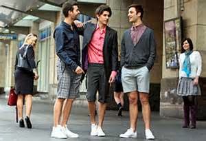
Shorts
-
. Since we’re still young, we can get away with shorts that are over half of the knee cap/a LITTLE bit over the knee


-
Stick to basic colors like khaki, grey, navy. If you’re adventurous, try out colors like the ones in thesecolors. Make sure that your colors match (blue/yellow, red/blue, etc).

- Since we (again) are still in hs, we can still get away with cargo shorts. Make sure that they fit like this
. Not too baggy, not to fitted, not too long (below the knee), and not too short (above the knee). Stick to colors like khaki, light khaki, and olive. And make sure that they DON’T look like these

with the slim pockets. We are kids, but these look too boy scout-y.
Jeans
- , not like this

, or ESPECIALLY NOT like this
).
- If you have bigger thighs, look at the 508 or 520′s. They’re tapered, which means they fit looser on the top, and fit like a slim fit/skinny jean on the bottom. They usually look better on actual people, because the models are to skinny to fill up the whole top half of the jean. The only warning I have is to make sure that below the knee, they fit you well, or else you’ll look like you have skinny chicken/girl calves.
- If Slim Straight or Straight jeans are you preference, the 514′s look better than the 501′s.
- Stay away from disgusting overbranding
, and bootcut/relaxed fit jeans. 501/514 are generally the loosest fit that can flatter guys.*

- Keep the colors darker. We can get away with distressing, and everybody else in high school wears it too, so holes, prewashed fades are fine. Just remember that when we’re older, they’ll look stupid on us, which is why MFA is against factory-made fades/holes.
- At this point, we/our peers could really care less if they’re selvedge or not. We’re gonna beat the shit out of it playing sports, partying, etc. so they don’t need to be an exceptional, top of the line, handmade in Japan, $400 quality jeans. Any pair will work. However if you do splurge on your jeans and get raw denim, our fades will be dopesickbadass with all the stuff we do.
Last Reminder: MFA usually advises
against American Eagle, Abercrombie, Hollister, etc, but since we’re
kids we can get away with their jeans. And pre distressing. And light
colors. And skinny fits. And holes. Have fun while it looks good on us.
Shoes
Versatility is key.
- As for shoes, canvas plimsolls (Vans/Keds style) and Chuck’s (converse) are good options, maybe boat shoes/chukkas can be pulled off. Van’s authentic canvas
in red, navy, black, or ebony ice grey look great. They’re low profile, sleek, and look good with the smaller leg openings that slimmer jeans have. These work well with either flat front or cargo shorts.

- Another plimsoll option is the leather Polo Ralph Lauren Vaughn. I get compliments from girls all the time about my shoes. I have the brown ones, and they look great with shorts, khakis/chinos, or jeans. However, they have fallen apart in 6 months with 4-times/week use.
- For the converse, stick to tried and true classic colors like red, black, and cream/white/off white. It’s your call between low cut and hi top Chucks, but I personally like the hi top version, as I’m not a fan of showing ankle when I’m wearing jeans. Unfortunately, these don’t look to good with shorts (hi or low).
- Some boat shoes will work, some won’t. Sperry Authentic Originals in Sahara work best with flat front chino shorts. The Sperry Bahama Chukka Boots look AMAZING in a suede/leather combo in tan or navy, but good luck finding these anywhere else. I’ve tried looking, but PacSun is the last place that I know of that has the suede/leather combo version in a nice color.
- Flip flops are fine. Stick to leather ones. Rainbow makes good ones, but Abercrombie/Hollister/American Eagle -esque style of leather flip flops are fine. If you must get rubber flip flops, Havaianas come in different colors and look good at the beach/pool. IMO, flip flops are kinda gross at school. You’re feet will probably sweat, and you’re at school, so kids might step on your shoes, stuff will get into your feet, etc.
match colors
So I know my skin color, what now?
In general, you want to draw attention to the face. One of the
reasons for the neckties persistence is this right here. A splash of
color or texture draws the eyes to the necktie and then up to the face.
Same with the pocket square. The eyes are drawn to the chest up to the
face. I like to have both these elements for this reason and this reason
alone. This is also a good argument for nice ties. They are essentially
the focal point of an outfit, might as well make it an awesome focal
point. Even if you aren’t wearing a tie, it is always wisest to try and
maximize contrast around the face and chest and not the pants and legs.When you approach a suit/sportcoat and tie outfit, think of the “V” made by your lapels and the tie and shirt within it as your canvas. This is the most important part of the outfit, and it is your chance to shine. Consider the contrast between shirt and tie. Consider contrast between jacket and shirt. Consider any accoutrements like tie bars. Consider the colors themselves. You have 4 basic colors to work with. They are:
Dominant shirt color
Dominant tie color
Dominant jacket color
Minor tie colors
I think it works best to make one of these colors the color of your eyes. If you have brighter eyes, shirt or tie color. If you have darker eyes, jacket color is probably better, or maybe as one of the minor tie colors. Take contrast into consideration within the “V” too. High contrast skin/hair/eyes, and this V should see more contrast. Low contrast and it shouldn’t. You can achieve this by opting for a white/whitish shirt for a high contrast or blue/brownish shirt for a low contrast. Another option would be to get a darker charcoal suit/navy for high contrast or a medium grey/medium or airforce blue color for the jacket for low contrast. A bright shiny tie bar will create a lot of contrast. A more mellow take (or no tie bar) will minimize contrast.
For shirts, the only solid colored shirts I would ever wear with a suit would be light blue, white, light yellow, pink, and maybe grey. If you work in a more conservative environment, stick to the first two. If you want more colors, I would suggest a patterned shirt with either stripes in the color you want or a graph check in that color. Gingham maybe. Plaid is really really iffy here. What I’m getting at is that I wouldn’t wear a solid red shirt (one of the reasons express always looks so off to me), but I would definitely wear a shirt with red stripes. Stick to a single color for stripes, and it is probably best if it is based on a white color.
For a businessy environment, a suit is gonna be a solid color or a really subtle check or stripe pattern. If you want more options, consider a sportcoat/slacks get up, but that’s not nearly as popular.
Finally for the moment of truth, the tie. “WHICH TIE SHOULD I PICK” is a popular question around here. Once you’ve narrowed it down to ties that are appropriate ( bleeding madras at an interview, not so much) here are some pointers:
Three colors to bring out: eyes, hair, and pocket square. Make one of the colors of the tie this color for best results
The tie will likely have more than one color to it. I like to stick with two colors, three at the most. In my experience you’ll either have the two colors sharing equal billing or one color as a background with the others as the minor colors. Use the background color to contrast with the shirt and jacket, use the minor color(s) to work with pocketsquare/eyes/hair.
If you opt for a solid color tie, consider getting a little texture instead. A knit texture, a gabardine texture, a slub cashmere or cotton or silk, anything with a little character to it. Makes a monochrome outfit more interesting.
Stay away from overly shiny ties. You can tell em when you see em.
Ultimate seasonal color guide
Contrast is the perceived difference between two different colors.You can have contrast of value – black and white are opposites, and the contrast between them will be stark. Blue and yellow are opposite one another on the color wheel, and the difference between them will be similarly extreme.
Colors that are more similar have less contrast. If the hue/saturation of two colors is similar, they will appear to blend together rather than stand out (like neighbors on the color wheel). The same is true of values that are near to each other.
The giant seasonal menswear color spectrum diagram thing

No comments:
Post a Comment